Best Sliders in Web Design 2023
How to use Sliders in Web Design
Are sliders here to stay? The Web Design industry changes a lot every year. New trends come and go, but Sliders seem to be sticking around for quite some time, they are a popular trend in web design, and for good reason.
They offer the ability to provide users with an attractive presentation of content without having to take up tons of screen space.
However, they also come with some drawbacks that you should be aware of before deciding if this is a good option for your site or not.
Sliders can be used for many different purposes on websites, such as pulling out certain features from other pages and presenting them in a single location or as an introduction page before showing visitors what's available on the rest of the website.
We'll talk about all these aspects and more below!
What are Sliders?
A slider is a tool that can be used to display content in a linear fashion with the use of arrows, usually on either side - a form of slideshow. They are often found at the top of web pages or on a homepage and they scroll across horizontally as you move your mouse over them or often automatically change content.
Sliders in web design are usually made up of a title, images, buttons for navigation, and text to read more. Slider images and text can be linked to other pages on the website to allow the user to navigate to related articles or resources.
Some sliders allow the user to navigate using various controls, but sometimes it can feel like you are fighting the slider as the content or image that you are interested in just vanishes to be replaced with another slide, not a great user experience.

Why the Love Hate relationships?
Web designers create sliders for a diverse range of purposes. Some will argue they are an outdated design, while others see them as innovative. However you look at them, there is no denying that sliders have greatly impacted the world of web design in both positive and negative ways.
The Pros:
Increased user engagement
One of the many benefits of sliders in web design is that they attract attention because human eyes are highly adapted to moving objects.
Just think how hard it is to see a camouflaged boa constrictor sitting on the branch of a tree compared to when it moves to attack its prey. It's the same for photos on your web pages. Text or static images just don't get as much attention or focus as those in content sliders.
Sliders provide a sense of movement that is perfect for capturing the attention of a user. The site visitors have an easier time staying engaged with the website because their senses are being stimulated.
Plus, they serve as a great way to display more than one image at a time. This is especially important when you think about the limited on-screen space.
Sliders can be used to create a perfect balance of visuals by creating a sequence of photographs designed to showcase products, services, a portfolio or whatever you want.

You get to show all your great products immediately
High bounce rates for online content are among the most difficult and frustrating issues in digital marketing.
When website visitors don’t feel engaged, many times it's because they have to dig through a lot of content to find what they want.
A web design using content sliders can present the most popular, the most highly rated content in a succinct style helping to keep the visitor engaged.
The Cons:
A common criticism of sliders is that they overwhelm users by giving too many options which are all of equal weight.
Further issues for user experience include:
- Banner Blindness: Visitors often view sliders the same way they do ads and skip over them.
- Content sliders slow down page loading with a resulting impacting on website SEO and conversion rates.
- Some sliders do not work well on mobile devices
- Rather than showcasing a just the best products or services, a company may be thought of as indecisive if they cram everything into slider to showcase every last product.
There is debate over the best approach for page design, one web designer may lead with Hero sections featuring stunning background images with a text overlay.
Others like to replace the hero section with a carousel that slides different images and text to present their design to the user.
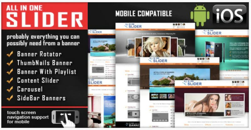
When to Use Sliders
Sliders are not always appropriate for a website, but they can be used to great effect. Start by analyzing what your user wants or needs from your website and how different pages of the website can be used to attain that goal.
- Sliders in web design can reinforce a brand’s identity and increase user trust.
- Chances are, you will lose conversion rates if the slider is poorly designed and/or creates confusion or distraction.
- Every business is unique, meaning some will benefit from sliders while others might not.
- One way to use sliders more effectively is to change the transition effects. For example, you can choose from a variety of additional transitions for the slider, such as fades or wipes instead of jerky horizontal slides.
- Make navigation quick and easy by providing prominent arrow buttons for moving backwards and forwards within a slider.

The options for a slider need to be carefully considered for the best usability, what style of navigation (arrows for next and previous are common), the different types of content to use, the use of space, etc
Give mobile website users a great user experience with the ability to swipe through slides rather than having to just watch a slideshow. Using sliders on mobiles doesn't have to be painful.
SEO and user experience can both be improved if lazy loading is used, photographs appearing in later in the carousel don't need to be loaded until they are needed.
Make sure your website designers optimize images and use the smallest image size to reduce page load times.
How to Use Sliders in Web Design: Tips
The web has a multitude of examples of websites utilizing sliders, but not all of them bring benefits to the sites.
Sliders are elegant design elements that can bring aesthetically pleasing results.
However, they will not have any benefits if they do not provide value to the visitors and they could have negative consequences if they cause poor user experience.
To achieve great results with sliders you'll need to follow the website carousel best practices:
- Always provide navigation. Make sure the slider is intuitive so users can navigate the slideshow on their own. Navigation is must-have, the more obvious, the better. Side arrows are commonly used for this purpose. Follow these conventions to avoid poor UX.
- Navigation should work well for touch-screen and mobile devices. Specifically, your users should be able to drag a slide or swipe through slides.
- Put the important items first. Some visitors wont want to wait to see a full slider presentation, so put the most important messages first.
- Don't use too many effects. Over doing effects can annoy website visitors.
- Set the slide swap delay time properly. If your users do not have enough time to read the information on a slide, they will feel they don't have control and may leave your site.
- Make your slider accessible for all groups of people.
- Test slider functionality across all screen sizes, browsers, and devices to provide an optimised experience for users.

Sliders for Product Tours
When website visitors see large chunks of text, it can be daunting and can cause them to leave your site to find a more welcoming one.
Sliders in web design are a visually engaging way to present a product that has several steps. By only seeing one step at a time, the amount of information presented appears smaller and less intimidating.
The use of graphics and smaller prompts can replace walls of text giving clear visual instructions on how to use your product.
Magic Slider
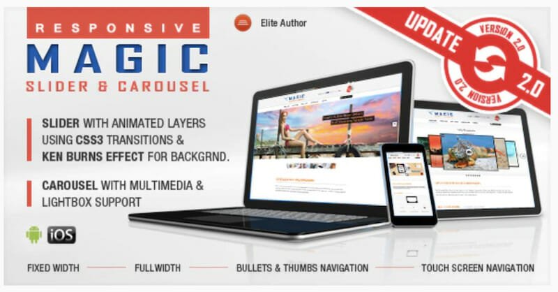
Make New Content Stand Out
One of the advantages a homepage slider can offer is that they allow first-time website visitors to quickly get a feel for the content that is available from the site.
Sliders in web design are an effective way of highlighting new content when you regularly update your website.
At news websites, the latest and most important material is usually showcased on the home page slider. This mirrors the ticker tape, at the bottom of the screen, that you see on TV news shows. A news website will try to use the same design as the TV show it supports, a slider on the website maps to a ticker tape on the TV screen.
Ultimate Sliders Bundle
Image Slider - Photo Galleries
There are times when one image alone can be used as an iconic representation of your brand. But there are other times when you might need to provide a deeper insight using a creative collection of your products, examples of use cases, supporting background information to better present your message.
An image slider can go beyond just displaying graphics but can allow the user to navigate through the gallery in the way they want, often a horizontal slider, offering thumbnails of many photographs is positioned below a much larger graphic that is the currently selected one, the current slide. This style of horizontal slider can often provide extra control to allow different information about the photographs to be displayed. The visibility of these is usually a choice that is made by the web designer.
Responsive Bootstrap Carousel
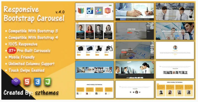
Image Slider - Flickr
You'll find some great examples of image sliders in web design and this style of carousels on sites such as Flickr. Here the slides contain a vast array of data about each photograph, the transitions are beautiful and usability is excellent.
The company also has an app that its designers have been very successful with. It features a slider carousel, and when the user scrolls through the slides they can access related photos information for each slide. A great slideshow.
Online Portfolio
There are many talented artists, web designers, graphic designers, and others who need to showcase their work through a website. One of the best ways to do this is through an online portfolio.
An image slider enables them to display their work creatively. Their site can use an image slider to organize their portfolio to their specification, slides can lead to related articles, or to example websites.
Some artists like to have a slideshow of their work accompanied by music, and each image is presented beautifully for the viewer.
Image sliders in web design can provide a perfect portfolio for many users that provide the usability and sense of creative flair their clients are looking for.
jQuery Slider Maker
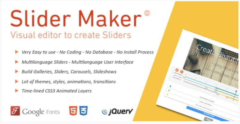
Are website sliders effective?
Use of the slider has become increasingly common in eCommerce. Every site uses a slider. Every site uses lots of sliders. You probably can't find a page on Amazon that doesn't have one form or a slider or other.
Sliders in web design for eCommerce are extremely prevalent.
Sliders - Amazon
Given that companies like Amazon are making slider use such a high priority, we must conclude that they are very effective at improving conversions, otherwise, they wouldn't use them.
On Amazon's site, every slider allows the user to control what happens. They don't generally make use of the automatic scroll image slider, not even on their homepage.
So is an image slider effective? The Amazon site says the image slider is effective.
Paradise Slider

Ecommerce Design
Online businesses can use sliders in website design to display a few of their company’s best-selling or recognizable products. As well as highlighting new varieties or flavors on offer, they are also able to subdivide the list into categories for easier shopping.
Sales of an e-commerce website can be improved by using a minimalist layout and leaving plenty of white space to allow the image slider to do its thing more effectively.
Analyse slider performance
Sliders are a great tool if used properly. Though they can be effective in some cases, sliders should not eat up an entire website. Use them carefully, and only when necessary; they will have the most effect as part of a larger layout.
One course of action is to run an A/B test in order to determine how people react to your page design and if they prefer one over the other. See which version has the higher conversions or brings the higher ROI. You can try an image slider against a static page. You can compare an image slider against a different slider design. You can tweak the controls the image slider offers, you can change the user's controls, make them more visible, turn off the auto-scroll etc.
Every page on your website should be tracked and every slider should be analyzed. Using Google Analytics or another similar tool will be able to show you how users are using your site. To get a very accurate insight into how users are navigating through your slider, you might light to install Hotjar on your website. This tool can show a detailed view of how your page was used.
Users are likely to lose interest when they click through various slides because the most compelling content often comes first. This issue can be compounded if subsequent material does not captivate users, which makes their time on the site longer and page load slower overall.

The best slider?
There are a huge number of Sliders available on the market today, I'd favor ones that are lightweight so they don't damage the UX through increased loading times. Such a Slider is Splide JS. This is a great Slider that has plenty of flexibility when you want to showcase your work or provide a slideshow of photos. They are default layouts that you can use as a starting point when designing a slide.
Splide JS
 Conclusion
When a website is designed to be user-friendly, the design process starts from the perspective of what the visitor wants. Each site has different types of visitors, so designers use a wide array of tools to display content in an appropriate manner.
A slider can create a more immersive browsing experience when used correctly.
FAQ
What is a website slider?
A website slider, also known as a carousel or slideshow, is a web design element that displays multiple images, text, or other media in a rotating manner on a website. It typically appears as a banner or prominent section on a webpage, allowing users to view different content by navigating through slides manually or automatically.
Why should I use a slider on my website?
Website sliders can be used to showcase multiple messages, products, or images within a limited space, providing a visually engaging and interactive element on your website. They can grab users' attention, convey important information, promote featured content, and enhance the overall aesthetic appeal of your website.
Can website sliders impact website performance and loading speed?
Yes, website sliders can impact website performance and loading speed if not implemented properly. Sliders often involve loading multiple large images or media files, which can increase the page size and potentially slow down the website. It's important to optimize the slider's images and code, use lazy loading techniques, and consider the impact on mobile devices and slower internet connections to ensure optimal performance.
Are website sliders effective for engaging visitors?
The effectiveness of website sliders in engaging visitors can vary depending on the implementation and user experience. While sliders can be visually appealing, studies have shown that they may not always capture users' attention or encourage interaction. Some users may overlook or ignore the slides, especially if they change too quickly or lack compelling content. It's essential to carefully consider the usability, relevance, and accessibility of the slider content to maximize user engagement.
Are there any best practices for designing and implementing website sliders?
Yes, there are several best practices to consider when designing and implementing website sliders:
* Limit the number of slides to a reasonable amount, avoiding excessive content overload.
* Ensure that each slide has a clear and concise message or purpose.
* Use high-quality and optimized images or media files to maintain performance.
* Provide intuitive navigation controls for users to manually navigate through the slides.
* Consider the timing and transition effects to avoid abrupt or distracting movements.
* Optimize the slider for responsiveness and mobile devices, ensuring a seamless experience across different screen sizes.
* Test the slider on various browsers and devices to ensure compatibility and functionality.

 Conclusion